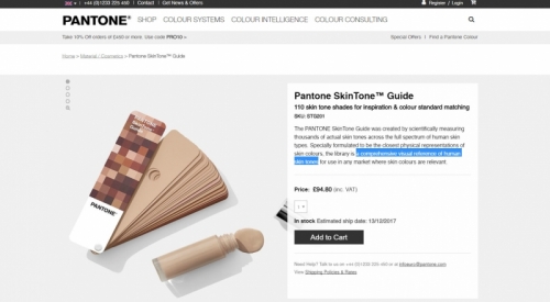
This morning I was looking at the Pantone website as we want to update our colour reference materials. My eye was caught by their skin matching books which claim to provide “a comprehensive visual reference of human skin tones”. The front cover appears to show a fair range but how they’ve fanned out the sample book seems to reinforce the default of ‘skin’ colour meaning caucasian skin colour. This is an assumption we came across when we worked on prosthesis cosmeses (covers for prosthetic limbs) that have a ‘skin’ colour stocking over the top. It’s interesting to note that truly inclusive design needs to start the second we open our mouths, at the very start of any discussion.
Website link: Prosthesis Cosmesis design: improved realism, longer life
